Benchmarking
The Benchmarking Worksheet enables side-by-side comparison of two process versions based on filters like region, department, time period, supplier, or product class. By visualizing process patterns and performance indicators in parallel or overlay view, users can easily identify deviations and optimization opportunities. Interactive filters and color-coded visualizations support process standardization, harmonization, and targeted improvement based on specific context information. KPI & PPI figures will recalculate based on the filters applied, but do not change when simply adjusting the number of variants shown.
Type: Tool Sheet
Filter-Settings

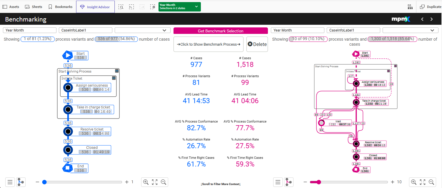
The filters at the top of the page, both left and right, can be used to define the two versions of the process you want to look at - for instance two regions (e.g. Europe vs North America), two years (e.g. this year vs previous year), two products or two suppliers.
Key Figures
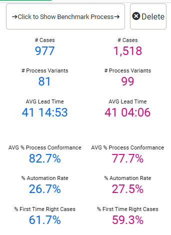
The PPIs represent the whole process and will recalculate as you modify the filters for the processes, but they will not change as you adjust the number of variants shown (e.g. top three variants vs top 10 variants).
In the picture of the PPIs above you can see the following:
- The right side has almost 600 more cases, but also more variants, than the process version on the left.
- More variants means it is less standardized and this is also reflected in a lower AVG% Process Conformance.
- The right side also has a slightly higher % Automation rate but a slightly lower % First Time Right Cases.
Benchmark a Process
You could simply look at two process versions side by side, but you can also overlay them to see the differences right away.
Click the button Click to Show Benchmark Process in the center of the sheet to move the left-side process over to the right side and on top of what was there. The goal, then, is to see how the left-side process differs from the benchmark process on the right.

Here is an example of how this could look like:
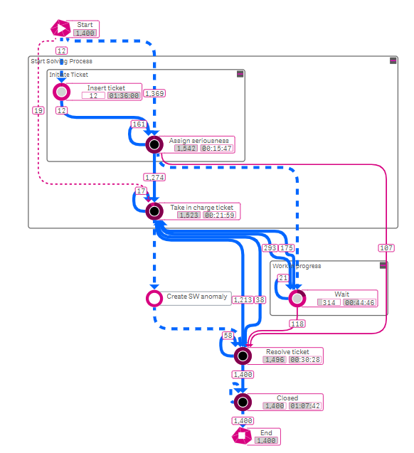
- Nodes from the left-side process version that are different from the right-side will have a white filling, e.g. Insert ticket.
- Nodes that are unique to the right-side process version have a grey inner filling, e.g. Work in progress.
- Edges from the process that are different will be dashed and colored in the color that represents their process version.
- So if the left-side process is blue, then edges that only show in the left-side process will be dashed blue.
- If the right-side process is pink, then edges that only show in the left-side process will be dashed pink.
- Edges that are the same for both processes will be a solid line in the left-side process' color (here that is blue).
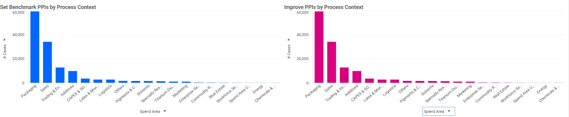
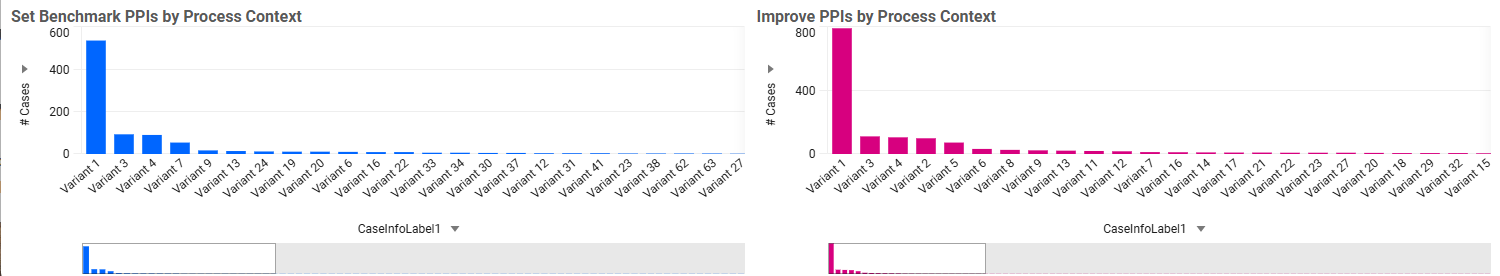
Bar Chart
Scroll down below the process analyzers to find two bar charts, reflecting each process version. Use the X-axis dropdown to change the dimension and Y-axis dropdown to change the measure to filter for a very specific process version and use this in your process comparison above.